The Elegant, Effective Election Data Visualization That Is Thankfully Not A Map
by Brian Timoney
We occasionally field the suggestion, nay, insinuation, that our posture here at Mapbrief is unduly critical. Whether it be pie charts, contiguous cartograms, or untucked shirts, our opinions are admittedly fixed. So much so that you might say “dogma”; we say “consistency”.
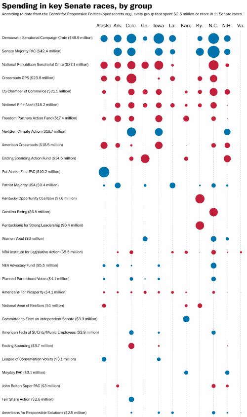
But in the spirit of staying positive, let’s admire this recent graphic from the Washington Post detailing campaign contributions:
Note the five dimensions of information: 1) donor name, 2) total donation, 3) state of Senate race, 4) receiving political party, and 5) relative size of state-level donation. As a bonus, the list is sorted top-to-bottom by total donation.
What makes me especially happy is that I can so clearly picture what this graphic could have been: a map of the US with the 11 states having some choropleth ramp (39 states of “no data”!), with a proportionally sized pie chart atop each state showing the party breakdown.
The horror.
Moral of the story: sometimes the best map is no map.
Great job by the Post team.
—Brian Timoney
