MapBrief™

Geography · Economics · Visualization

Mapping’s Gaming Future Can’t Come Quick Enough

Confession:  my gaming career ended in 1979 when Asteroids was released.  Overwhelmed by multi-axis movement and the hyperspace button, I allocated my arcade quarters to analog pinball and turned my back on console gaming.

As my mapping career marches into its third decade, I impatiently await the re-energizing of online mapping that can transform the massive amounts of new geographic data and visualization techniques into something even fractionally compelling as fake gaming landscapes.

In 2013 my frustration with the stale GIS paradigm being stuffed into a browser and called a “portal” was extreme enough to write five blog posts on the topic.  Fast forward to the present, and every couple of months a well-meaning soul will reference the series and remark “and nothing has changed!”

If only I could weaponize an exclamation mark.

While the mapping tilt towards gaming and gaming-like landscapes and experiences has been underway awhile, whether it be Google Maps and Mapbox offering Unity SDKs or ESRI’s CityEngine offering.  But a couple of recent announcements caught my eye:

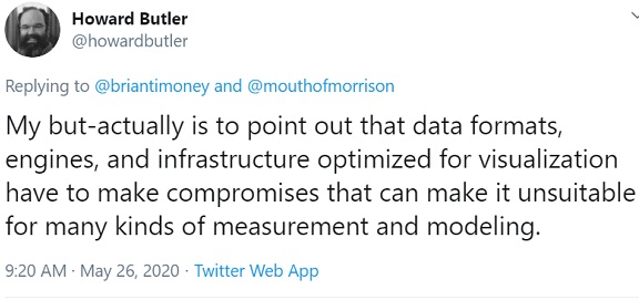
Now with frames-per-second being one of the most important metrics to be optimized in gaming, one of the advantages of fake landscapes is they can be created, modified, and, well, faked to optimize on frame rate.  Howard raises the question as to whether these optimizations can’t help but come at the expense of geodetic accuracy when using “real” geographic data:

That said, the second announcement is very interesting insofar as it appears to be a global scale effort to make the “real world” work in the gaming context:  I’ll be cheering Cesium on.

Now if the current status quo of online mapping mostly works for you, you’re asking if all of this is “must have” or merely “nice to have”. During a recent webinar put on by L3 Harris, multiple participants talked about the desire for a more immersive experience, etc.  But I would put it more strongly:  in a world where organizations are spending more money for custom data collection– imagery, LiDAR. IoT, etc.—they will soon demand a consumption experience commensurate with their data purchase.  We can’t make our clients spend more on ingredients but continue to serve them generic too-long-under-the-heat-lamp consumption experiences.

  *   *   *   *

Enough with this weak tea hand-wavy thought leadership bro–I want custom terrain in my video games now.

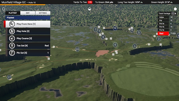
No problem.  Bro.  I hope you like golf.

Because we here at Mapbrief believe in the spirit of DIY.  In The Golf Club 2019  , there are tools for users to create their own courses, etc.  So one particularly motivated user published a tutorial for using USGS LIDAR data and OpenStreetMap data for creating your own real courses.

So let’s celebrate that in some small measure that the era of Bring-Your-Own-Data to your favorite video game has already arrived!

— Brian Timoney 

Few Interact With Our Interactive Maps–What Can We Do About It?

We are a species of gazers, not clickers:

If you make a tooltip or rollover, assume no one will ever see it.

— Archie Tse, NY Times Graphics Dept

When one of the top creators of general audience data visualizations can only lure 10-15% of their audience into clicking on anything, let alone “diving” into the data, we producers of interactive maps need to take notice. It was an excellent post by Dominikus Baur that deepened the conversation by contrasting the time we creators think about features and functionality with the time spent thinking about audience need.

Read it.

For me, it was deja vu all over again. Four years ago I wrote extensively about interactive map portals and their many flaws:

So what can we do?

Static Maps

Just because you’re publishing a map to the web, doesn’t mean it has to be a web map.  If a user is only going to spend 10-15 seconds with your map without interacting, why spend two weeks wrestling with your Javascript?  And the great thing is the focus a static map brings–a single view, a single story: don’t bury the lede.  Most of your web mapping platforms have easy to use Static APIs (Google, Mapbox, CARTO, Mapquest, et al) where a map is just a URL away, and you’re desktop GIS can output something web friendly.  And don’t forget that after many, many years SVG is now a first-class citizen of the web, directly viewable in the browser–and you don’t need fancy software to create a sexy map.

Small Multiples

If users aren’t going to interact with a time slider, give them Small Multiples–they’re Tufte approved!

In fact, small multiples may be a better cognitive choice than a time slider because the eye can jump back and forth much more easily to compare patterns.

Animated GIFs

If we in the mapping industry have over-invested in interactive maps relative to user engagement, we most certainly have under-invested in one of the most popular ways to share content on the web.

The animated map GIF.

As with small multiples, it’s a natural fit for time series data.  But you can also create the mini story map:


More Text Box

You know what interaction your users are completely comfortable with?

Text-based search.

Filter first with text search, and make the search box big and obvious.

 Your Map Is The Exception

Sure it is.

The Engineering Department loves it, right?

If internal users are your most important constituency, fine.  But don’t pretend you’re doing your public users any favors with the overly busy interface that of course looks okay to you.  If public engagement is a priority, review the analytics (you’d be surprised how many shops don’t even do this).  If you’re still unconvinced, there are people to help you understand how exactly your map is used.

 *  *  *  *  *

Look, you’re reading this blog because you believe in the unique power of a map.  But to make a map is also to think about its delivery mechanism:  Mercator started out making money from globes; his buddy Ortelius innovated with his atlas.  We 21st century descendants are blessed, and cursed, with a vast audience armed with a fleeting attention span and a thumb with which to engage with, or quickly dismiss, our wares.

— Brian Timoney 

Screen gaze photo courtesy of  Eiti Kimura ‘s Flickr account

Geographically Balancing Supply and Demand: Car Sharing in Denver

How do you geographically match supply and demand in the new sharing economy?

For lodging, the old way was to have a fixed number of hotel rooms whose prices rise as the beds fill up. The new way is having AirBnB email potential providers of rooms and informing them of demand spikes in their local area and providing price forecasts from their in-house demand models.

In transportation, the old way was fixed bus routes on set schedules supplemented by a taxi fleet whose supply was limited by a medallion/licensing system.  Should there be a spike in demand, you’re either standing inside a packed bus or waiting a long time for a cab.  The new way is for an Uber or Lyft to text its drivers that demand is high and urging them to go out and server high-demand areas while at the same time applying surge pricing to customers–tweaking both supply and demand to bring them into balance.

So it was a very specific spatial curiosity that drove me to find out how car2go vehicles moved throughout the Denver area given that a) vehicles can be picked up and dropped off anywhere in the service area and b) there is a flat per-minute/per-hour rate no matter the day or time of travel. In short, how well does this system spatially match supply and demand?

The following is an excerpt from a more in-depth report you can get here.

By the Numbers

  • Over 176,000 car movements noted between August, 2015 and January, 2016 by snap-shotting the public availability map every 10 minutes. We have no actual trip data or actual routes–trips are merely inferred from the public map.
  • Around 340 vehicles are available throughout the service area on any given day.
  • Typical trip was between one and two miles.
  • Typical car makes three trips per day.
  • Trip destinations concentrated downtown and in the immediately adjacent neighborhoods.
  • 41% of trips occur during weekday rush hours (7am – 11am, 3pm – 7pm)
  • 7% of trips start and end within 200m (“errand trips”)

Map:  The Service Area

During the study period, the car2go service area consisted of central and northwest Denver neighborhoods as well as an area around the University of Denver in the southern portion of the city. A recent expansion of the service area reconnected the southern portion with the main service area: an obvious improvement in network connectivity.


Map:  AM Rush Hour

Weekday morning trips are heavily concentrated in the downtown business district. One of the benefits of car2go is that you can park at metered spaces for no charge–a huge convenience and a topic I take up in depth in the full report (click here).

Map:  PM Rush Hour

In the afternoon, we see a more dispersed pattern of trips downtown and the nearby neighborhoods. We see notable concentrations in Five Points along the Blake St/Walnut St corridor as well as the North Capitol Hill/Capitol Hill neighborhoods which have the highest density of housing in the city.

Weekend/holiday patterns are roughly similar to the PM rush hour pattern and are covered in the full report (click here).

**Note: the hexagons outside the service area boundary represent particular car2go pickup/drop-off points usually at public transportation locations, entertainment venues, etc.

Map: Car Turnover

Given the pattern above of AM concentration of destinations and PM dispersion, we can infer where cars would turnover the quickest, but how different is the turnover time in neighborhoods farther from downtown?

Very different.

This map highlights the key challenge of the car2go business model:  when a service charges a single price regardless of the time of day or the driver’s destination, spatial imbalance is the very predictable result.  Bike-sharing programs exhibit similar behavior, but those networks can be re-balanced by trucking a large quantity of bikes around the city throughout the day.  Re-balancing an automobile network by using employees to drive cars to busier locations is much more costly.

More maps and analysis can be found in our full report here.

Dynamic Pricing and The Driver-less Future

One of obvious remedy for the spatial imbalance of the car2go network is to have a pricing system that more flexibly responds to where cars are “stranded” and incentivize users to drive them to more high demand areas. That’s great in theory, but as Uber’s experience with surge pricing has shown, folks don’t much like supply-and-demand if it means they perceive they are paying “more than they should”.  And think about the demands car2go already puts on its user base:  i) users have to open an app or map online to figure out where are an available car may be and ii) users then have to navigate themselves to the car. As someone who thinks about map interactivity and navigation everyday, I assure you these skills aren’t as prevalent among adults in 2017 as you may suppose.  Adding in another layer of dynamic pricing may very well just create more customer service headaches than a more spatially balanced network is worth.

By now you probably have guessed what the ultimate answer will be to geographically balancing a car sharing network:  self-driving cars that can move themselves into areas of high demand. What we have now are opaque economic models with implicit subsidies e.g Daimler providing the cars for its own service in car2go’s case while oceans of venture capital subsidize every Lyft and Uber ride.  All of it feeling like a scramble to establish network effects before the dramatic changes the shift to self-driving cars will bring.

Get the full in-depth report here.
 

— Brian Timoney 

Denver photo courtesy of  Ken Lane ‘s Flickr account