Few Interact With Our Interactive Maps–What Can We Do About It?
by Brian Timoney
We are a species of gazers, not clickers:
If you make a tooltip or rollover, assume no one will ever see it.
— Archie Tse, NY Times Graphics Dept

When one of the top creators of general audience data visualizations can only lure 10-15% of their audience into clicking on anything, let alone “diving” into the data, we producers of interactive maps need to take notice. It was an excellent post by Dominikus Baur that deepened the conversation by contrasting the time we creators think about features and functionality with the time spent thinking about audience need.
For me, it was deja vu all over again. Four years ago I wrote extensively about interactive map portals and their many flaws:
- a visual grammar derived from desktop GIS unfamiliar to most
- too much content that forces users to sort and sift
- End-user experiences driven by often niche internal requirements
- tools that create confusion rather than lead to insight
- we don’t properly value an end-user’s time
So what can we do?
Static Maps
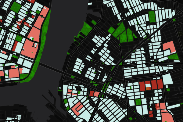
Just because you’re publishing a map to the web, doesn’t mean it has to be a web map. If a user is only going to spend 10-15 seconds with your map without interacting, why spend two weeks wrestling with your Javascript? And the great thing is the focus a static map brings–a single view, a single story: don’t bury the lede. Most of your web mapping platforms have easy to use Static APIs (Google, Mapbox, CARTO, Mapquest, et al) where a map is just a URL away, and you’re desktop GIS can output something web friendly. And don’t forget that after many, many years SVG is now a first-class citizen of the web, directly viewable in the browser–and you don’t need fancy software to create a sexy map.
Small Multiples
If users aren’t going to interact with a time slider, give them Small Multiples–they’re Tufte approved!
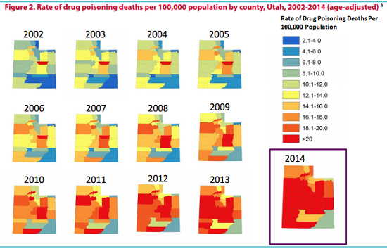
In fact, small multiples may be a better cognitive choice than a time slider because the eye can jump back and forth much more easily to compare patterns.
Animated GIFs
If we in the mapping industry have over-invested in interactive maps relative to user engagement, we most certainly have under-invested in one of the most popular ways to share content on the web.
The animated map GIF.
An update on ‘visualising a lot’: I’ve re-designed, & added cumulative total to the gif, which I think works better: https://t.co/EtrcRMre9N pic.twitter.com/ynalgnVki9
— Alasdair Rae (@undertheraedar) April 5, 2017
As with small multiples, it’s a natural fit for time series data. But you can also create the mini story map:
Why #China‘s plan to build a new #SilkRoad runs through #Singapore #dataviz #map #geoeconomics #geostrategy https://t.co/79AqbgExj8 pic.twitter.com/eiRk63hcU1
— Fatma E., PhD (@FatmaEr_PhD) April 3, 2017
More Text Box
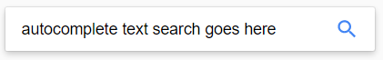
You know what interaction your users are completely comfortable with?
Text-based search.
Filter first with text search, and make the search box big and obvious.
Your Map Is The Exception
Sure it is.
The Engineering Department loves it, right?
If internal users are your most important constituency, fine. But don’t pretend you’re doing your public users any favors with the overly busy interface that of course looks okay to you. If public engagement is a priority, review the analytics (you’d be surprised how many shops don’t even do this). If you’re still unconvinced, there are people to help you understand how exactly your map is used.
* * * * *
Look, you’re reading this blog because you believe in the unique power of a map. But to make a map is also to think about its delivery mechanism: Mercator started out making money from globes; his buddy Ortelius innovated with his atlas. We 21st century descendants are blessed, and cursed, with a vast audience armed with a fleeting attention span and a thumb with which to engage with, or quickly dismiss, our wares.
— Brian Timoney