Jogging a Mile in Each of Denver’s 78 Neighborhoods to Break 26 Years of Spatial Habits
How well do you know the town you call home?
After twenty-six years in Denver, most of it tucked up in its northwest corner, I suspected my own honest answer would be “not very”.
So when I decided to take a personal sabbatical of sorts this Spring to ponder a mid-career refactoring in the brave new world of AI, I reflected that I needed to get a bit agentic myself about “touching grass” in my home city and remediate the flawed familiarity with the geography around me that had been stunted by the routine spatial habits of everyday life.
The Project
• jog a mile in each of the city’s 78 statistical neighborhoods
• include a city park in the route (only 4 neighborhoods had no park)
• access neighborhoods using a combination of public transportation and bicycle
Thoreau famously travelled widely in Concord; it was time for me to travel widely in Denver.
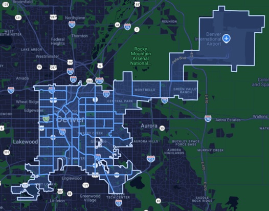
Denver’s 78 neighborhoods (for an interactive map with jogging routes click here)
Despite the cumulative distance equaling three marathons, the physical component wasn’t really the point. Trust me, no one in notably fit Colorado is impressed by 11-minute miles. No, this was about being intentional in seeking out the inconvenient and unfamiliar other sides of town that were never “worth” my time. We are told that searching out the new and novel in distant lands is worth the expense in order to acquire “broader” perspectives. What if a similar un-narrowing was available close to home for next-to-nothing?
The Cognitive Consequences of Our Spatial Habits
The research is clear: spatial navigation is deeply entwined with cognitive ability and memory. We know that these functions are co-located in the brain’s hippocampus: note the common dementia symptom of “wandering”. But how are we to understand how the brain is influenced by our everyday routing decisions?
The foundational paper is Edward Tolman’s “Cognitive Maps in Rats and Men” that laid out the case that our habitual travels create linear “strip maps” of our surroundings rather than a broader, more comprehensive understanding. Observing rats in a maze, repeating successful routes “works” until the maze changes and confusion sets in. The unchanging everyday routes inhibit our internal Waze-like ability to re-route on the fly in the face of the unexpected. Hence, our dependence on…Waze, Google Maps, et al deepens. Subsequent research expanded on this strip map idea to show that we store routes as corridors but are bad at understanding what is adjacent to the corridors and indeed moving between corridors.
Nobel Prize-winning research (2014) points to an even more mind-blowing relationship: the same grids of cells in our brain on which spatial memories are encoded are also used for organizing non-spatial memories, critically providing temporal coherence and the ability to “replay” memories. Clearly in the realm of our brain architecture, spatial couldn’t be more special.
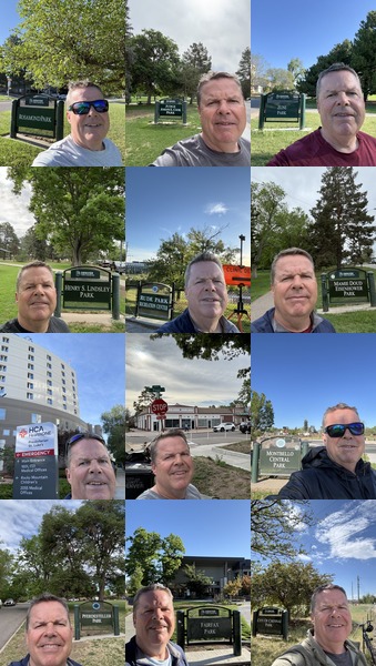
You see a collage of selfies, I see spatial anchors of memory
* * * * * *
On July 3rd I was just another jogger in Washington Park doing the loop and taking advantage of the cooler early morning hour. Sure, finishing all 78 neighborhoods in 66 days had the psychological satisfaction of completing a goal, regardless of its scope of ambition. But maybe the win was a fresh skepticism of the algorithmically optimized routes that dictate my daily movements. And in being more intentional about the inefficient detours and the goings out-of-the-way for their own sake that would fire a few more grid cells in the brain that would otherwise be dormant. After all, the science points more clearly than ever that who we are is where we’ve been and a coherent memory of self is not the product of frequent flyer miles or passport stamps but rather a richer, broader geographical understanding of the everyday places we call “home”.
— Brian Timoney