Daring To Build a Citizen-Centric Homepage: The Philadelphia Story
by Brian Timoney
Over the holiday the City of Philadelphia posted an “alpha” version of its new website and encouraged public feedback: a nice example of customer engagement and iterative improvement. But also a reminder of how local government webpages fail their would-be users in some very basic ways. As someone who has seen the local gov web sausage up close, I have feedback.
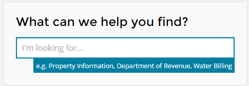
Good Thing #1: A Big, Obvious Auto-Complete Text Entry Box
After 15+ years of googling, this should be a no-brainer.
You know who hasn’t gotten the memo? Three of the four largest cities in the US : New York, Los Angeles, Houston. (Good on you, Chicago). Not having auto-complete on your homepage is not asking your user to find the needle in a haystack, it’s asking the user to find the needle in the haystack while blindfolded.
Good Thing #2: Making Prime Webpage Real Estate Useful
If the top half of the web page is supposed to contain the most valuable, urgent content you absolutely want to get in front of the visitor, then the puzzling decision many cities make is to use this real estate to show you pictures. Where are you going to go for a slide show of Seattle– Flickr or the Seattle.gov webpage? But that’s small beer compared to what LA has going on: their oversized slide show includes “Best of The Web” and “Digital Cities” awards. Which, come to think of it, may well be an effective way for LA to communicate that its most distinctive quality is bewildering self-regard.
Where’s The Mayor?
Maybe I’m biased, coming from a city where there have been rumors of prolonged discussion of the relative pixel sizes of the mayor’s photo and the city council’s photo on the homepage, but the size and position of the mayor’s photo seems to be a good indication of either his or her power or the degree of internal sycophancy–I can’t decide which. Goodness knows that in our age of Facebook/Twitter/Instagram, mayors have other channels with which to assert their brand, so maybe they don’t need to be the first thing a citizen looking for the trash pick-up schedule sees.
What’s Missing? The Street Address
Look, on the web we’re all narcissists. Impatient ones at that.
So in that autocomplete box on the homepage let residents enter in their address to take them directly to their property information. Not just their assessments, etc. but also the nearest park, library, police station, school, parking regulations, etc. Don’t make them hunt for that information on each department’s separate web page: link outward from their individual property page.
How hard would it be to enable auto-lookup for Philadelphia’s half million addresses? Well, you can try this simple app I created two years ago for another blog post. Still seems to work, mostly.
* * * * * * *
Let’s be straight: search engines have made home pages increasingly irrelevant as citizens look to Google first in navigating the informational morass of their local government’s website. But doesn’t this imply that the users who still start with the homepage are in more need of intuitive search tools?
Whatever the case, it’s a positive sign that at least one city is prioritizing the digital needs of its citizens over the prerogatives of glib self-promotion that have too long been the default mode.
—Brian Timoney
Philly photo courtesy of Jakob Monstrasio’s Flickr stream

