What If The Fix For the Geospatial Workforce “Crisis” Is…Better Pay?
I saw some of the most talented Spatial Minds of my generation…take non-spatial jobs for better money.
Recently LinkedIn brought me tidings that two people in my network took new positions with no obvious link to the Geospatial industry. In their spatial endeavors, these folks were technically adept, innovative, and happy to volunteer to speak about their work at industry get-togethers.
And now they’re gone.
And I don’t blame them.

A Supply Problem?
This came to mind as I watched a program titled The Geospatial Workforce Crisis: A Diversity of Pathways Forward put on last month by the National Academies of Sciences, Engineering, and Medicine. Industry veterans from academia, government agencies, and the private sector came together for four hours of presentations and panel discussions addressing the current and projected shortage of workers in the Geospatial industry.
In the main the content was thoughtful and interesting, but one thing bothered me: over the four hours there was little to no conversation about compensation.
Look, 21st century Late Market Capitalism has its flaws, but the basic dynamics of Supply and Demand haven’t been suspended: if there is a shortage of something you want and need, well, there’s a price for everything.
The Consequences of the GIS Silo
What’s the GIS Silo? It’s the decades-long insistence that GIS was so magically distinct that it was to exist apart from mainstream IT.
The GIS Silo was great for vendors: define a niche market and insist your customers’ niche technical requirements couldn’t possibly be understood, let alone subsumed, by a normal IT department.
The GIS Silo was okay-ish for the training/education industry. Following the Vendor lead, they could teach some theory and some software and there were usually some OK jobs waiting for industrious students.
The GIS Silo is no longer working for its Practitioners.
Every day you fiddle with interfaces that promise to GUI the complexity away, you’re costing yourself money.
The larger IT industry is rewarding SQL skills.
The larger IT industry is rewarding Programming skills.
The larger IT industry is rewarding Data Pipeline management.
The larger IT industry is rewarding Data Visualization chops.
Inside the GIS Silo the most lucrative credential is now…a Security Clearance.
Sure, few of us got into this industry for the money, but also few of us can avoid the 21st century middle-class conundrum of School Loans/Mortgage/Kids – Pick Two and ignore the discrepancies in compensation.
It’s All About Distributions
The compensation issue simply isn’t about a single median figure, it’s about the distribution. Let’s compare GIS Analyst vs Business Analyst courtesy of Zip Recruiter:
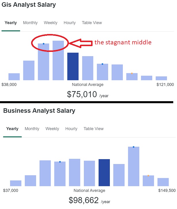
Even discounting the vagaries of job titles, the skew in the distribution of GIS Analyst salaries is notable because it implies a stagnant middle grinding away while effectively blocking the ability of new entrants to rapidly ascend the wage scale as you’d find in more “normal” distributions (check out the distribution of Data Scientist to see what even greener grass looks like).
If your most skilled practitioners are leaving and the stagnant middle can’t advance technically, then we see the all-too-common GIS Manager solution: a job posting for entry-level positions with a blizzard of acronyms that reads like a Rosetta Stone of Vendor-Foisted Technical Debt. I’m no expert on the hopes and dreams of Gen Z, but maintaining your early 2000s SOAP web service for fry-cook wages is not a future that galvanizes the imagination.
* * * * * * * *
For all of the hand-wringing about labor prospects in the “AI Future” I’m confident that anyone working with Data will be fine: data quality issues will be huge and presenting clear visuals of increasingly complex relationships in data will only increase in demand. Markets for Geospatial know-how will grow, from a dynamic Remote Sensing industry to anything touching climate issues. For practitioners there’s never been more opportunities to independently enhance their skill sets. And maybe, just maybe, the real “crisis” in the industry is the insistence on holding on to a Status Quo from the Past that is no longer serviceable for its Practitioners.
— Brian Timoney