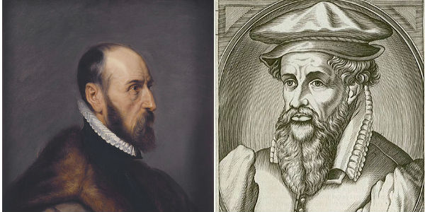
The New Golden Age of Cartography Has Arrived…and It’s Co-Ed
by Brian Timoney
That the web mapping explosion of the past few years has ushered in a new Golden Age of Cartography has been noted more than once (here, here, and here). But what is really exciting is that the increasing variety of tools for map-making are engaging folks from a variety of disciplines, including the emerging field of Information Design. For those of us with traditional GIS training, the delight of encountering great cartography in unexpected places is tempered by the realization that while we GISers are good at making maps, we seem especially adept at making ugly maps.
Recently, this issue of Ugly got an interesting airing on LinkedIn (of all places). Opinion ranged from aesthetics-are-important to just-get-the-data-to-line-up to the reliably defensive you-callin’-my-map-ugly? I think back to my first introductory GIS course where we learned the old chestnut that 80% of a GIS project’s budget is taken up by data acquisition and whipping it into usable shape. By the time it comes to making the final product–a map–there’s been enough wailing and gnashing of teeth that the default color palette and the generic symbol set seem plenty OK. That, and your project is over-budget and past its deadline. Little wonder then, that Ugly in GIS became Good Enough.
Another equally important thing I learned in grad school is that one never wants to be accused of heteronormative essentialism. Around the grad school seminar table, that’s the male equivalent of being Hester Prynne. But even though I’m a guy, I occasionally notice things. Like my first line of defense against the onslaught of Ugly is the indispensable Color Brewer, the brainchild of Cynthia Brewer at Penn State. Like looking up “GIS cartography” on Amazon brings up Gretchen Peterson’s GIS Cartography: A Guide to Effective Map Design. Like ESRI’s Mapping Center, headed up by Aileen Buckley, is almost evenly divided between men and women. In an industry numerically dominated by front-pleated khaki-wearing dudes (author included), such data points are something other than mere coincidence.
And since the singular form of data is anecdote, I’ve noticed in my own consulting work that my female clients are much more willing to articulate their reactions to my design decisions. At the other end of the critical spectrum are my overwhelmingly male Oil & Gas clients for whom there is no combination of garish yellows, reds, and greens that will elicit more than a grunt or a shrug. Like being on a group camping trip, as long as no one showers, the pungent funk goes unnoticed.
Besides being a well-intentioned shout-out to the design eye of the ladies, why does any of this matter? Because good design enhances comprehension. As the stories we are trying to tell with maps become more multivariate and nuanced, the penalty for thoughtless design is at best puzzlement, at worst misunderstanding. We have arrived at a point where the ‘general user’ does notice the difference in cartographic presentation between Google Maps, Bing, Mapquest, and Open Street Map. And as we’ve been told ad nauseum in the past week, the genius of Steve Jobs was understanding average folks form intimate attachments to great design.
~ ~ ~ ~ ~ ~ ~ ~
This past weekend, we were inundated with online maps of Hurricane Irene and its menacing of the East Coast. In the aftermath, I came across this interactive map by the New York Times –the pace-setters when it comes to online information design. Clean layout, easy navigation, and a variety of thematic mapping techniques all making bulky, multivariate data accessible to the average user. Scrolling down to the bottom, I noticed the authors: Joe Burgess, Amanda Cox, Alicia Parlapiano, Archie Tse, Lisa Waananen and Tim Wallace.
A new golden age indeed.
—Brian Timoney
