MapBrief™

Geography · Economics · Visualization

Nate Silver Does Spatial Analysis and So Should You

Who’s up for another Nate Silver post?

You know, the guy who single-handedly save America from the pox of Triumphalist Innumeracy. As both a post-Election victory lap as well as promotion tour for his new book The Signal and the Noise, Silver gave a number of interviews that I enjoyed including the one below at Google.

YouTube Preview Image

At the 48:10 mark he mentions a project on rating New York neighborhoods, and observes in passing that the per-sqaure-foot cost variation in apartment prices can largely be explained by distance to midtown Manhattan, proximity of (quality) schools, and proximity to parks.  According to Silver using just these three variables yielded a r-squared value of 0.93 i.e. 93% of the variation in per-square-foot cost can be explained by the variation in these three variables (a very robust result, by the way).  Those of us who work in the geospatial realm typically have a nodding familiarity with distance weighting, hotspot analysis, spatial autocorrelation, etc.  But using spatially-derived measures in more standard statistical techniques such as multiple regression strike me as a more likely analytic scenario in the day-to-day “data science” work that we’re all promised is the future.

Nate Silver used spatial measures to determine Park Slope is the most desirable neighborhood in New York


Your “Data Science” is Worth Little Without Clearly Communicated Reasoning

A couple of weeks ago Marc Andressen made headlines by stating that English majors and other humanities types were sentencing themselves to professional futures in shoe stores.  As an all-too-typical prejudice of the engineer-centric tech scene, it summarily ignores a piece of the Nate Silver phenomenon every bit as important as his statistical modelling savvy:  his writing ability.  What set Silver apart was that he was explaining his quantitative reasoning clearly, discussing possible weaknesses of his model, and addressing criticisms of his work all on a daily basis.  As a prominent financial blogger noted, the combination of a robust, well-reasoned model combined with a narrative fluency is the true sweet spot.  So by all means, sign up for a Data Analysis course and get your feet wet with R, but keep your Chekhov and Munro within easy reach as well. The world is already plenty full of ineffectual factotums bearing scatter-plots getting steamrolled by those comfortably reliant on their lifetime of hunches.


It’s Not About the Size of your Hadoop Cluster

 
Yes, this.


—Brian Timoney


* Park Slope photo courtesy of  WallyG’s Flickr stream


JS.geo 2013: A Meeting of Javascript Mappers in Denver

So some Colorado folk have rustled up a get-together geared towards those who make maps using Javascript APIs.

JS.geo January 14-15, 2013 Denver CO

It’s not a “conference” and no one is making money: we’re charging $11.54.

There will be no “tracks”: Monday the 14th we’ll have talks (full talks, lightning rounds, etc.) in a single room.

The second day, the 15th, we’ll have office space for small-group work, collaborative coding, or free-association white-boarding.


REGISTER HERE

So…what’s the point of this again?  Well, everybody knows that at most conferences the most valuable take-aways are the conversations among attendees. So let’s get-together and make the content of those hallway conversations the focus: particularly the “who’s doing what” and “wouldn’t it be cool if…” bits.

Who’s In?  The registration page has the RSVP list–you might recognize a few names. We expect folks from OpenGeo, Vizzuality, MapBox, Stamen, ESRI, Google, et al.

What’s the catch?  Ah, the catch.  We’re capping attendance at 75 or so.  And we’re already halfway to that quota.

If you’re a sleeves-up web mapper working with Javascript front-ends, this might be the best $11.54 you ever spent.


—Brian Timoney


ADDENDUM: First-day facility is being provided courtesy of the Facility for Advanced Spatial Technology (FAST) at the University of Colorado Denver. We are grateful for their support that enables us to keep the cost of this event to a minimum.


* Denver skyline photo courtesy of  dagpeak’s Flickr stream

“Finally: the election map that isn’t a lie.”

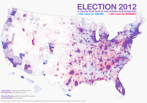
Best-selling science writer James Gleick refers to this map by John Nelson a bunch of us were linking to over the weekend (click for larger version):


Dot-Density, FTW

Based on similar work by Kirk Goldsberry, John took county-level data and posted a red dot for every 100 votes for Romney, a blue dot for every 100 votes for Obama.  The map effectively preserves the familiar geography of the continental US while accounting for the wide variation in population density.  Further, areas of electoral dominance by each candidate are easily identified, while the hues of purple effectively communicate mixed voting preferences.


The Limited Usefulness of Cartograms

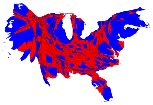
I recall cartograms rising to prominence in the wake of the 2004 election with the maps of Gastner, et al at the University of Michigan. Mark Newman has continued that work and put out maps for the recent presidential election.  Here’s his cartogram based on county-level data:

In my mind, the cartogram is most effective in counteracting the visual dominance of the large “red” states in the middle of the US that tend to be more sparsely populated than the more densely populated coastal areas that often vote Democrat (in cartography-speak:  the areal unit problem).  But in re-shaping areas based on population, the cartogram runs up against a severe cognitive limitation:

Humans are really bad at visually comparing areas of shapes

Or, to put it another way,

HUMANS ARE REALLY BAD AT VISUALLY COMPARING AREAS OF SHAPES

This inability to accurately compare relative sizes of 2-D shapes are what make pie charts such a flawed approach to comparing quantities.  Add in the irregular shapes of counties, let alone the audience familiarity, or lack thereof, with the actual county sizes and shapes, and you’re left with a visual that doesn’t easily lend itself to close, prolonged inspection.

Contrast it to John’s map where the viewer is invited to closely inspect and discover all sorts of interesting patterns:  the reds of Appalachia, the blues of the 19th century slavery belt, the surprising purple found in the Salt Lake City metro area, etc., etc.


Who Decided Democrats are Blue and Republicans are Red Anyway?


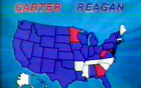
Interestingly there is no Constitutional amendment decreeing Democrats be depicted in blue and Republicans in red.  This interesting Smithsonian post claims it wasn’t until 2000 that the familiar color assignments became the de facto standard and set the stage for all manner of sociological comparison.


Elections Are Good For Mapping

High profile elections raise all cartographic ships. Friends and family mention specific maps they’ve seen in the media, etc., and we in the industry try and soak up the vicarious admiration.  And the maps that stand out, such as John’s, invite others to share in the intellectual satisfactions of geographical exploration that led so many of us to make this avocation our vocation.


—Brian Timoney


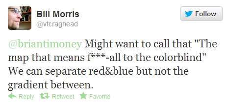
UPDATE:  A valid criticism has been lodged–

In 2012, the color-blind are America’s forgotten 8%.