There Are Few 2nd Impressions Online
Mom was right: we live in a judgmental world where first impressions linger.
On the web, it’s worse: the majority of us are impulsive information grazers on a restless daily quest to gather the factoids, bite-sized insights, and small amusements that feed a post-modern soul.
So when building an online web map to capture these 40 seconds of distracted attention, the challenge is to manage the initial perception of your content with the assumption that no one reads the small print before diving in. And as we’ve mentioned many times before, the user response to confusion is not “maybe I should read the Help”; they simply leave.
What I discuss below aren’t “bad” maps per se (a couple of them are very well executed), but rather come with perception-management challenges that, while addressed through text, nonetheless open a gulf between what they are trying to communicate and what the distracted, hurried user (admittedly, me) is absorbing in the first few seconds of inspection.
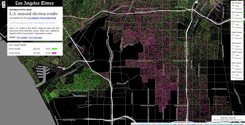
One Dot/One Vote In Los Angeles Mayoral Race
I loved this map that was published by the LA Times the day after the mayoral election. But then I winced when I saw “One dot = one vote”. Because having a background in Elections I was darn glad I wasn’t manning the phones the next day…
Irate Citizen: “Why does the LA Times have a map of where every voter lives and who they voted for? That’s an unlawful violation of privacy!”
Before explaining the very defensible methodology of placing a dot randomly within the voter’s precinct boundary, Irate Citizen has slammed the phone down and is now composing invective for his City Council-person.
The larger point is that people impute a very high degree of precision/accuracy to anything that is placed on an official-looking map. So if one dot equals one voter, then that voter must be exactly where he/she is placed on the map. Never mind it’s written twice that dots were randomly placed. I would’ve gone for One Dot = 5 Voters just to break that instant mental link between a single voter, their location, and their secret ballot that is the cornerstone of democracy.
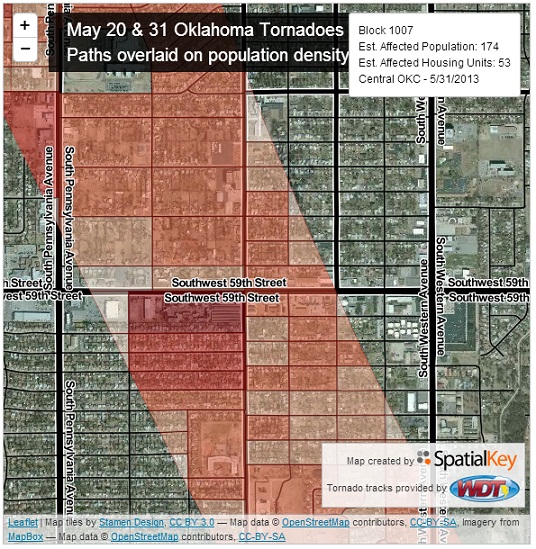
Oklahoma Tornado Damage Estimates
Over the last few years I have been impressed by the work of SpatialKey and would rank Doug McCune (@dougmccune ) in my Top-5-Funniest-Presenters-I’ve-Seen-At-A-Tech-Conference. But disaster mapping is tricky because things are moving fast and emotions are raw.
It clearly announces itself as a Population Density map with tornado tracks overlaid. In the immediate aftermath such information is handy in trying to wrap one’s head around a basic sense of scale. But as soon as the skies clear we have expectations of actual damage assessments. Further, the use of a red palette is not emotionally neutral, especially in the context of a disaster. So with your varying shades of red you’re asking too much of the viewer NOT to infer that the most intense reds indicate the greatest damage (rather than the highest concentration of residents). Add the mercurial nature of tornado damage–one neighbor’s house is leveled, another’s is untouched–and one wonders whether the choropleth approach should have been left on the sideline until actual damage could be tallied and mapped.
Yes, That Is A Lot of Data
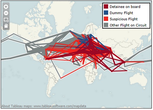
This Guardian map was depicts 11,000 CIA rendition flights. Which is a lot. But with an initial view that displays all of those routes, the first impression is one of visual confusion. A handy rule of thumb is to give your viewer an insightful look of the data on the initial load so even if they don’t interact with the map but merely gaze at it for 5-7 seconds they’ll have a useful takeaway. I’m not sure this map meets that threshold.
When Photoshop Attacks
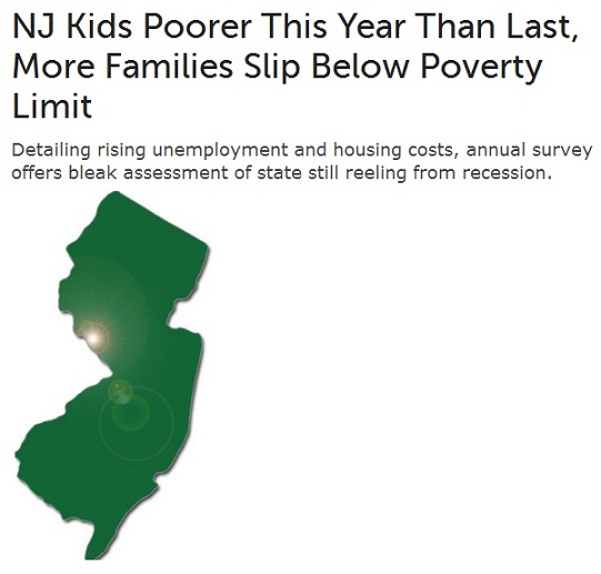
A symptom of advanced cartophilia is looking for meaning in a map where there is none. This gem was passed around among a few of us on Twitter–
You’re immediately tempted to grab your cube-mate: “bro, check out this pattern of crazy intense poverty in southern Hunterdon County.” Then you remember that Hunterdon County, NJ is one of the top ten wealthiest counties in the US.
You’ve just been punk’d by a headphone-wearing, Photoshop-wielding Millennial who is so much better than his crap graphic design job. And is probably too young to recall this Onion classic.
* * * * * * * *
There is an unfortunate asymmetry between the time it takes to craft an effective online map and the time viewers actually spend with it. Often we’re presenting large amounts of not-easily-digestible data to someone not completely paying attention, may not be wholly fluent in the emerging grammars of visual information, and with a hair-trigger mouse finger eternally poised to click through to the next thing. Bridging the gap between the reality of your map and the perception of your map can often seem thankless.
Welcome to the web.
—Brian Timoney


