MapBrief™

Geography · Economics · Visualization

The Travelling Salesman Problem Is Not a Routing Problem, It’s A Monetization Problem

Creative destruction is awesome until it comes for your livelihood.

 

Having made a few dollars over the years building custom routing applications, I had two distinct reactions when testing out the Straightaway app recently after reading this Mapbox post.

“this is way cool and efficient” 😀

“time to look for another way to make money solving geospatial problems” 🙁

Of course routing has been firmly on the path of commodification since at least the Mapquest days in the late 1990s.  When Google Maps came along with dynamic re-routing in the browser I was so delighted and befuddled I had to ask Brian Flood to explain to me (slowly) how this magic was happening.
 

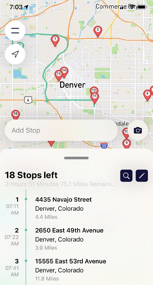
The app’s pitch  is to optimize multi-stop delivery routes—the freemium version lets you route up to 25 stops, with some near real-time traffic awareness, and get an ordered set of stops with precise time estimates.  But the real user-experience win is the OCR address detection of your list of stops using your phone camera!  I printed out a list of 18 addresses spread around Denver and in a minute I had my detailed route.
 

 *  *  *  *  *  *  *

What’s been the most valuable innovation in routing?

Hands down: turn-by-turn voice directions.

Without turn-by-turn voice directions, there is no multi-billion dollar gig economy of ridesharing and delivery because you would never have a critical mass of drivers if traditional map-reading skills were required (let alone their  brute-force memorization a la “the Knowledge”).  As geography enthusiasts, we wish that weren’t the case, but the World isn’t what it Ought to be (in so many ways).

Perhaps that’s the real lesson we should take away from a cool app that disrupts our Income Streams:  spend more time thinking about UI/UX form factors that empower a broader audience rather than simply focusing on the geospatial wizardry that impresses our small in-group.


— Brian Timoney 



Google Knew We Didn’t Want to Kill Spreadsheets. We Wanted A Billion Rows.

Study after study shows the negative health impacts of soda.  And 7-11 has responded to market demand with a 128oz Mega Gulp.

For as fashionable as it is in the data community to feign exasperation with spreadsheets and the chaos they cause — mangling numbers and text, crimes against dates and times, relative vs absolute cell references, etc. — Google saw into our hearts and has granted our deepest unspoken wish.

The billion-row spreadsheet.

Actually, it’s wiring up Google Sheets to BigQuery tables so the data doesn’t live in your spreadsheet per se (one good measure of disaster prevention!) but you can manipulate and analyze in a Google Sheet using standard tools e.g. pivot tables.  As Ben Collins noted, the real win is doing work using these familiar spreadsheeting methods instead of writing SQL queries.  Which is true, because SQL is a chokepoint.

“But everyone who works with data should learn SQL.”

And more Americans should learn a foreign language.

When asked how an adult may go about learning a foreign language, the linguist John McWhorter memorably replied “It’s hard. Sleep with somebody, frankly.”  And while readers of this blog skew towards passionate lovers of data, willing to harness SQL for all manner of subqueries and cross lateral joins, the audience of those who merely want to shake hands with their data and answer a couple of questions is much larger.

Audience size and uptake–the key metrics we dismiss too easily.  The spreadsheet is the signal achievement of the PC era and a three-decades track record of being the backbone of quantitative work.  As any UI/UX pro knows, having millions of users willingly engage with an interface and its visual vernacular is very, very difficult.  Despite its drawbacks, the spreadsheet is entrenched for good reasons and for the most part Familiarity Breeds Productivity.

Let’s warmly welcome the Billion Row Spreadsheet as another step forward in the democratization of quantitative analysis.


— Brian Timoney 


Panama Canal photo courtesy of  Helen@littlethorpe ‘s Flickr account

15 Years of Google Earth and the Lessons That Went Unlearned

Google Earth turns 15 this Sunday.  Are you celebrating?

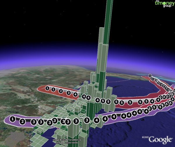
oil production impacts due to Hurricanes Katrina & Rita–extruded data bars ain’t new bro


If you’re a mapping professional, your reaction might be a mix of wistfulness and condescension as you haven’t popped open Google Earth in years let alone dealt with a KML file.  The urge of the carto-cognoscenti to dismiss Google Earth has been strong from the outset, and now all these years later we’re still too slow to acknowledge what it’s gotten right.

 *  *  *  *  *  *  *

The week after launch I was at a Fourth of July picnic outside Philadelphia where I knew few people, so was uncharacteristically in listening mode.  I remember clearly a not-sober guy with only two things on his mind:  a) arguing with his wife about having a third child and b) a new mapping thing he discovered–

“Go to EARTH DOT GOOGLE DOT COM and download that sh*t!”

That is what Silicon Valley refers to as traction.

It was immediately on its way to be the most successful desktop mapping interface ever.  Despite its popularity–or because of it, honestly–those of us who build and sell web mapping applications continue to draw the wrong conclusions as to what it all meant to us professionally.  Three aspects come to mind:

  •  Google Earth led us to vastly overestimate the average user’s willingness to figure out our map interfaces.  The user experience was so novel and absorbing that people invested time into learning the interface:  semi-complex navigation, toggling layers on and off, managing their own content, etc.  Unfortunately, our stuff isn’t so novel and absorbing and we’ve learned the hard way that even those forced to use our interfaces for work seem very uninterested in even the most basic interactions.
  • A killer use case that the industry still hasn’t replicated is “double-click email attachment, immediately see map content.”  The popularity of Google Earth–and its ultimate penetration in the workplace (especially Oil & Gas / natural resources sectors) — meant you could send a KML file as an email attachment and be somewhat certain you knew what ended up on the recipient’s screen.
  • Users creating and sharing data.  The KML data format combining both spatial coordinates as well as styling made many insiders uneasy.  I wonder if the preference for this tidy segregation didn’t also carry a faint whiff  of the-guild-made-uneasy-by-the-democratization-of-tools.  We never tire of reciting the horrors of Excel while never bothering to tally the benefits side of the ledger:  there’s more than a little of that with KML and how it empowered the masses to create, style, and share spatial data much easier than in the past.

 *  *  *  *  *  *  *

We don’t hear much of Google Earth these days, though even my recent experience in the energy industry is any indication, its usage and ubiquity still remain strong.  Development of the original application seems to have  mostly stopped and the Mapboxes, Cesiums, and the Cartos of the world have taken up the web mapping mantle.  But what hasn’t been replicated has been the absorption and sense of wonder that a mapping application triggered fifteen years ago this week.