15 Years of Google Earth and the Lessons That Went Unlearned
Google Earth turns 15 this Sunday. Are you celebrating?
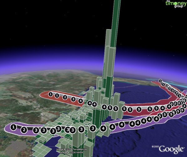
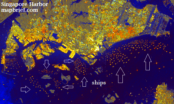
oil production impacts due to Hurricanes Katrina & Rita–extruded data bars ain’t new bro
If you’re a mapping professional, your reaction might be a mix of wistfulness and condescension as you haven’t popped open Google Earth in years let alone dealt with a KML file. The urge of the carto-cognoscenti to dismiss Google Earth has been strong from the outset, and now all these years later we’re still too slow to acknowledge what it’s gotten right.
* * * * * * *
The week after launch I was at a Fourth of July picnic outside Philadelphia where I knew few people, so was uncharacteristically in listening mode. I remember clearly a not-sober guy with only two things on his mind: a) arguing with his wife about having a third child and b) a new mapping thing he discovered–
“Go to EARTH DOT GOOGLE DOT COM and download that sh*t!”
That is what Silicon Valley refers to as traction.
It was immediately on its way to be the most successful desktop mapping interface ever. Despite its popularity–or because of it, honestly–those of us who build and sell web mapping applications continue to draw the wrong conclusions as to what it all meant to us professionally. Three aspects come to mind:
- Google Earth led us to vastly overestimate the average user’s willingness to figure out our map interfaces. The user experience was so novel and absorbing that people invested time into learning the interface: semi-complex navigation, toggling layers on and off, managing their own content, etc. Unfortunately, our stuff isn’t so novel and absorbing and we’ve learned the hard way that even those forced to use our interfaces for work seem very uninterested in even the most basic interactions.
- A killer use case that the industry still hasn’t replicated is “double-click email attachment, immediately see map content.” The popularity of Google Earth–and its ultimate penetration in the workplace (especially Oil & Gas / natural resources sectors) — meant you could send a KML file as an email attachment and be somewhat certain you knew what ended up on the recipient’s screen.
- Users creating and sharing data. The KML data format combining both spatial coordinates as well as styling made many insiders uneasy. I wonder if the preference for this tidy segregation didn’t also carry a faint whiff of the-guild-made-uneasy-by-the-democratization-of-tools. We never tire of reciting the horrors of Excel while never bothering to tally the benefits side of the ledger: there’s more than a little of that with KML and how it empowered the masses to create, style, and share spatial data much easier than in the past.
* * * * * * *

We don’t hear much of Google Earth these days, though even my recent experience in the energy industry is any indication, its usage and ubiquity still remain strong. Development of the original application seems to have mostly stopped and the Mapboxes, Cesiums, and the Cartos of the world have taken up the web mapping mantle. But what hasn’t been replicated has been the absorption and sense of wonder that a mapping application triggered fifteen years ago this week.