MapBrief™

Geography · Economics · Visualization

Dear ESRI Business Partner: Your Revenue Model Died Last Week

It wasn’t supposed to be this way.

The Cloud was supposed to be mostly hype, and the part that wasn’t had something to do with Google.  If this year’s ESRI Users’ Conference was overly focused on ArcGIS Online, you reasoned, it was merely the new shiny bauble in Redlands.  If its president seemed a little fixated on The Cloud, well, he’s an excitable guy eager to communicate his excitement about exciting things. But with the conference being the great venue to catch up with colleagues and clients  (not to mention the car-free nightlife), you told everyone it was a “good conference”: mostly meaning that San Diego is one of the few pleasant places left in America to spend a week in July.  Maybe after the conference you went on vacation to recover spend quality time with the family. Two weeks out of the office–you know how the game is played.

Let me bring you up to speed on what you missed while you were away: ESRI killed your business model.

See, you make your money as an “intergrator”: tweaking software, servers, and interfaces to meet end-user needs. Your bread and butter are the big government contracts: federal agencies (DoD and Homeland Security if you’re especially lucky) and some larger state projects.  Margins are nice, and they make for a comfortable office building in a suburban office park (see: Reston, VA).

it's business, not personal

Hyman Roth explains to Michael Corleone that "this is the business we've chosen": never personal, just business


First, during the UC, a press release dropped on a Lockheed/ESRI collaboration on web-based apps using ESRI’s cloud infrastructure aimed particularly at the DoD/Homeland Security sector. In and of itself, not red-flag worthy. But then this little gem dropped, detailing a USDA-wide implementation of ESRI’s cloud infrastructure. Read between the lines: ESRI is no longer content to merely have its software be a line-item in the large contracts: it’s selling its platform and all of the ancillary services around it, with “scalability” being code for “we plan on being the dominant provider for the largest clients.”  Think about this way:  ArcGIS Online means fewer ArcServer licenses for small- and medium-sized shops; direct-connect to spatial databases means a lot less use cases for ArcSDE (thank goodness).  That loss of revenue has to be made up somewhere, and Redlands has pushed its chips on the square marked “Cloud”.  See this as a page out of the IBM playbook where the real money is in high-margin services, with software merely being the means to that end.

So where does leave you, the ESRI Business Partner? You better have some serious stroke in your business domain (e.g. Lockheed), or have analytic “secret-sauce” services not easily replicated by ESRI. The “me-too” stuff and the marginally useful branded add-ons won’t be enough anymore in a world where ESRI is no longer shy about doing ESRI better than you do ESRI.

~ ~ ~ ~ ~ ~ ~ ~ ~ ~

But let’s stop being gloomy and address the situation in a proactive way, a forward-leaning posture if you will. Change doesn’t happen overnight, so I’d estimate you have about two years to figure out how you’re going to make money five years from now. If there was ever a time to engage in a little of that out-of-the-box thinking, now would be that time. Because you need ideas. If the phrases “Vice President”, “Strategic”, “Accounts”, “Marketing”, etc., appear anywhere on your business card, your company is looking to you to figure this one out. Lucky for you I can help out.  In mid-September, the brightest minds in geospatial will be gathering in Denver, Colorado discussing software and possibilities without the vendor pep rally vibe.

“Open source?  But there’s no business model there.”

Yeah, we knew you would say that. So we set up a special day-long event that is both an introduction to geospatial open source as well as a broad discussion of how people are making money integrating open source components. And then we take the discussion to a microbrewery.

Details here.

We realize it’s a busy world, so you can just pay for this one-day event, or add it on to a full-conference registration. If time is tight, my playbook would be to go to the one-day event on September 13th, and have your most trusted geek do the deep-dive sessions during the rest of the week. You’ll come away with a bunch of intriguing ideas; the rest is up to you.

Get with the program.


—Brian Timoney

Realtor Data Is More Authoritative Than Surveyor Data

Since the rise of “neo-geography” 5-6 years ago, there has been heavy deployment of the adjective “authoritative”, especially by vendors who serve traditional producers of geospatial data . Unimpeachable accuracy and the gravitas of expertise are what is being implied here, especially in contrast to the unruly new worlds of crowd-sourcing and mashups of heterogeneous information. But the problem is that professionals define authority in units of centimeters while users–aka the public–define authority very differently.

Authority? That’s your position in Google’s search results.

In the US, real estate sites dominate address search results with "authoritative" geo info nowhere to be found


And that’s where our friendly neighborhood realtor enters the story. With beaming faces on business cards and the unshakable faith that it’s always a great time to buy, realtors have figured out search engine optimization (SEO), much to the detriment of the geospatial industry.  Because at least here in the US, type in any residential address into a search engine, and you’ll be sifting through a blizzard of real estate results before you’ll uncover any links to authoritative content directly produced by geospatial professionals.  Of course we users of the web don’t “sift”: if it’s not on the top half of the first page of results, it’s dangerously close to being invisible.

A couple of years ago, Jason Birch of Nanaimo, BC blogged about making municipal data more user-friendly by optimizing its Google-ability.  He laid out the rationale for creating searchable sitemaps for GIS data so it could be discovered the way people are accustomed to finding other information: via the search engine.  With the ascendance of REST-ful architectures that enable access to individual spatial features as unique resources via a standard HTTP request, all of the ingredients seemed to be in place to make authoritative geo information easily discoverable.

But it hasn’t happened. Instead we get ever more complicated, er, “rich” web mapping portals with one way in, and icons normal users often find confusing. Let’s start prioritizing SEO for Geo with the premise that Google may be a person’s first stop when looking for information. Sitemaps for search engine indexing are not a complicated technology. We recently rolled out a small project for a municipality with limited web resources, with SEO, that has yielded decent results in the first few weeks.

There is a great quote from Bill Parcells who was fond of assessing his teams’ performances by saying “you are what your record says you are.”  As an industry we need to wake up to the fact that in web mapping we’re playing by the rules of the web where what you are is largely a function of your search engine ranking. If reaching the public with your information is indeed the goal, then measuring authority strictly in terms of spatial accuracy misses the point in an impatient world where accessibility and findability trumps all.

Just ask a realtor.


—Brian Timoney


When A Map Goes Viral

For better or worse –ok, worse–CNN’s John King remains the popular face of choropleth mapping in the US for his election night wizardry.  (Our friends across the pond definitely have the better of it with the BBC’s Emily Maitlis–I could watch this crisp analysis, touching on the areal unit problem even, for hours.) But with mapping tools such as Google Fusion Tables, GeoCommons, Tableau, et al,  now well within reach of non-GIS specialists, we are going to see proliferation of all manner of thematic maps on the web.

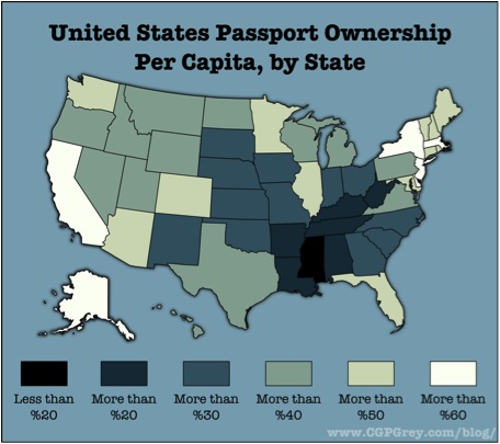
A few months back, a map of US Passport ownership by state, created by CGP Grey, a blogger with no particular mapping background, went viral, getting picked up by The Huffington Post, Andrew Sullivan, and urban theorist Richard Florida, among many others. Of course my professional eye was immediately drawn to some problems with the cartography, but something larger didn’t seem right:  frankly I didn’t believe the map.  To think that in some of our most populous states (CA, NJ, NY), more than 6 out of every 10 people you pass in the street have a valid passport? That didn’t pass the smell test, and in digging around for answers some larger themes emerged.

First, the obvious carto-geek stuff.  A blue color ramp with a blue background? Not recommended. The lighter hues of blue being associated with higher values should be reversed–increased saturation should reflect “more” of whatever variable is being mapped. If casual mappers take any tip to heart, it should be to visit Colorbrewer.org to get solid color ramps with which to represent your data.  The data breaks chosen work pretty well: round number increments that don’t confuse the viewer while showing the variation in the data, especially the states at each extreme of the distribution.

As for the data, the blogger should be give major props for explaining his assumptions and linking to a Google spreadsheet of his data.  Since state-level data was only available for 2007-2010, he extrapolated backwards another six years (passports are valid for 10 years) to get his estimates. But in 2007 there was a major change in US policy where, as part of the Western Hemisphere Travel Initiative (Orwell-speak alert), passports were made mandatory for travel to Canada, Mexico, and parts of the Caribbean. Using 2007-2010 as a baseline then skews the numbers upwards: indeed his estimate of overall number of passport holders (@ 149M)  is about 30% higher than the actual aggregate number (114M) found here. More importantly, our map no longer says what we think it says since the high estimates would be concentrated in states that border Mexico and Canada, or have a disproportionate number of residents who travel to the Caribbean (think of the immigrant populations of NJ/NY/FL/IL). This fixation on the data is admittedly pedantic, but the map becomes significantly less compelling once these factors are weighed.

~  ~  ~  ~  ~  ~

But let’s not bury an amateur mapper. Because in the cutthroat competition for attention on the Internet, he absolutely nailed it: he found a dataset others found compelling and mapped it in a way where dominant patterns were quickly perceived.  Bluntly put, people inferred the story he was trying to tell. In our world of ubiquitous data the skill of visual storytelling, especially on the ADD savanna of the web, is something we who “do” cartography and GIS on a daily basis would do well to ponder more deeply in our everyday work.


—Brian Timoney