Geographically Balancing Supply and Demand: Car Sharing in Denver
by Brian Timoney
How do you geographically match supply and demand in the new sharing economy?
For lodging, the old way was to have a fixed number of hotel rooms whose prices rise as the beds fill up. The new way is having AirBnB email potential providers of rooms and informing them of demand spikes in their local area and providing price forecasts from their in-house demand models.
![]()
In transportation, the old way was fixed bus routes on set schedules supplemented by a taxi fleet whose supply was limited by a medallion/licensing system. Should there be a spike in demand, you’re either standing inside a packed bus or waiting a long time for a cab. The new way is for an Uber or Lyft to text its drivers that demand is high and urging them to go out and server high-demand areas while at the same time applying surge pricing to customers–tweaking both supply and demand to bring them into balance.
So it was a very specific spatial curiosity that drove me to find out how car2go vehicles moved throughout the Denver area given that a) vehicles can be picked up and dropped off anywhere in the service area and b) there is a flat per-minute/per-hour rate no matter the day or time of travel. In short, how well does this system spatially match supply and demand?
The following is an excerpt from a more in-depth report you can get here.
By the Numbers
- Over 176,000 car movements noted between August, 2015 and January, 2016 by snap-shotting the public availability map every 10 minutes. We have no actual trip data or actual routes–trips are merely inferred from the public map.
- Around 340 vehicles are available throughout the service area on any given day.
- Typical trip was between one and two miles.
- Typical car makes three trips per day.
- Trip destinations concentrated downtown and in the immediately adjacent neighborhoods.
- 41% of trips occur during weekday rush hours (7am – 11am, 3pm – 7pm)
- 7% of trips start and end within 200m (“errand trips”)
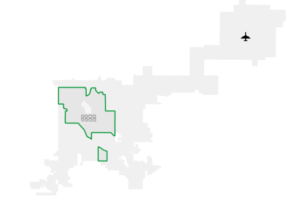
Map: The Service Area
During the study period, the car2go service area consisted of central and northwest Denver neighborhoods as well as an area around the University of Denver in the southern portion of the city. A recent expansion of the service area reconnected the southern portion with the main service area: an obvious improvement in network connectivity.
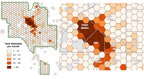
Map: AM Rush Hour
Weekday morning trips are heavily concentrated in the downtown business district. One of the benefits of car2go is that you can park at metered spaces for no charge–a huge convenience and a topic I take up in depth in the full report (click here).
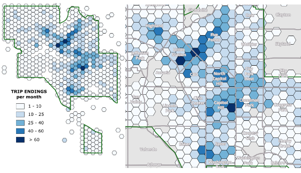
Map: PM Rush Hour
In the afternoon, we see a more dispersed pattern of trips downtown and the nearby neighborhoods. We see notable concentrations in Five Points along the Blake St/Walnut St corridor as well as the North Capitol Hill/Capitol Hill neighborhoods which have the highest density of housing in the city.
Weekend/holiday patterns are roughly similar to the PM rush hour pattern and are covered in the full report (click here).
**Note: the hexagons outside the service area boundary represent particular car2go pickup/drop-off points usually at public transportation locations, entertainment venues, etc.
Map: Car Turnover
Given the pattern above of AM concentration of destinations and PM dispersion, we can infer where cars would turnover the quickest, but how different is the turnover time in neighborhoods farther from downtown?
Very different.
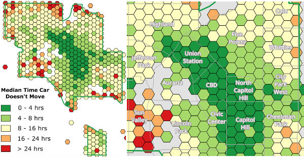
This map highlights the key challenge of the car2go business model: when a service charges a single price regardless of the time of day or the driver’s destination, spatial imbalance is the very predictable result. Bike-sharing programs exhibit similar behavior, but those networks can be re-balanced by trucking a large quantity of bikes around the city throughout the day. Re-balancing an automobile network by using employees to drive cars to busier locations is much more costly.
More maps and analysis can be found in our full report here.
Dynamic Pricing and The Driver-less Future
One of obvious remedy for the spatial imbalance of the car2go network is to have a pricing system that more flexibly responds to where cars are “stranded” and incentivize users to drive them to more high demand areas. That’s great in theory, but as Uber’s experience with surge pricing has shown, folks don’t much like supply-and-demand if it means they perceive they are paying “more than they should”. And think about the demands car2go already puts on its user base: i) users have to open an app or map online to figure out where are an available car may be and ii) users then have to navigate themselves to the car. As someone who thinks about map interactivity and navigation everyday, I assure you these skills aren’t as prevalent among adults in 2017 as you may suppose. Adding in another layer of dynamic pricing may very well just create more customer service headaches than a more spatially balanced network is worth.
By now you probably have guessed what the ultimate answer will be to geographically balancing a car sharing network: self-driving cars that can move themselves into areas of high demand. What we have now are opaque economic models with implicit subsidies e.g Daimler providing the cars for its own service in car2go’s case while oceans of venture capital subsidize every Lyft and Uber ride. All of it feeling like a scramble to establish network effects before the dramatic changes the shift to self-driving cars will bring.
Get the full in-depth report here.
— Brian Timoney