Mapping the Census and the Sincerest Form of Flattery
by Brian Timoney
The life of an IPO-less entrepreneur is a curiosity, especially in difficult economic times. So when well-meaning folks ask “what is it like?”, I answer that while there’s great freedom in working on one’s own ideas, that’s counterbalanced by the realization that most of one’s ideas range from the merely unworkable to laughably money-losing. But failure can be a more effective teacher than success: stay in the game long enough one develops a bit of judgment in distinguishing wheat from chaff.
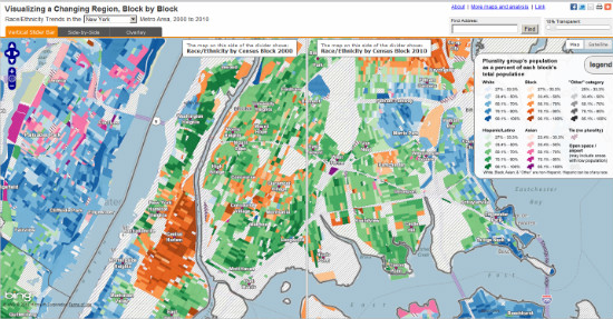
So when Steve Romalewski and his team at CUNY’s Center for Urban Research released their block-by-block race/ethnicity maps for 15 major cities, my immediate thought was “this is an extremely cool way to understand important patterns in a very bulky data set.”
My second thought? “I need to steal this.”
(If you believe the famous Picasso quote “good artists borrow, great artists steal”, then ponder to what depths of mendacity a work-a-day web mapper willingly lowers himself.)
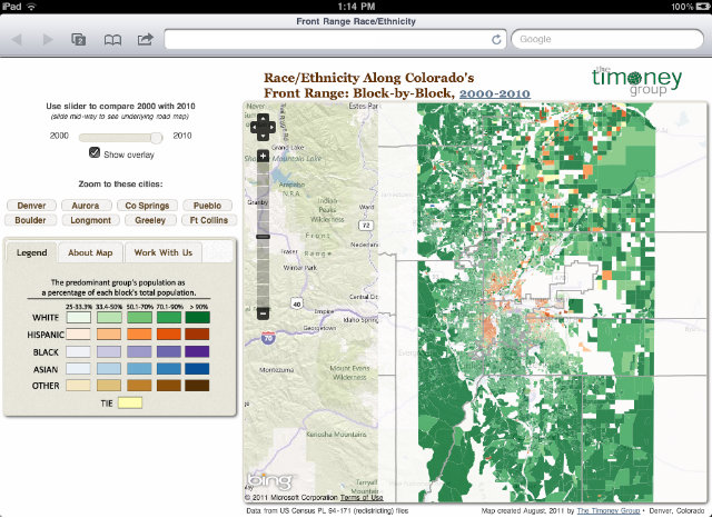
Working on the decennial redistricting process in Denver, we applied CUNY’s mapping technique to our own data and found a fascinating mix of gentrification, edge growth, and ethnic-group displacement that will have a substantial impact on the city’s politics in the next decade. So I thought making a web map covering Colorado’s Front Range (roughly Pueblo to Fort Collins) would be both intellectually interesting as well as a chance to work with some newer tools.
Map: Race/Ethnicity Along Colorado’s Front Range: Block-by-Block, 2000-2010
Like the CUNY map, we’re using the Bing basemap for its thorough neighborhood-scale labeling as well as easy REST tile access. Using a custom slim build of the latest OpenLayers dev release, we get the new touch support. Throw in a touch of CSS magic from Tobin Bradley’s GeoPortal project, and we get a decent-looking map that works on touch phones and tablets with little extra work. The tiles themselves were created in the TileMill cartographic studio: a true pleasure to use and a tool that will merit its own post next week.
(I’d be remiss if I didn’t mention that FOSS4G will have OpenLayers guys, Tobin Bradley of GeoPortal, and the Development Seed crew who created TileMill.)
From a developer’s perspective, the map doesn’t “do much”: a couple of tile layers, a slider, and zoom-to buttons. No round-trips to a database, no drill down information. While unpaid side work definitely puts one in the mood to simplify, it’s also out of respect to the intended audience of non-technical users in Colorado. Because chances are they surf like you and I surf: with a bit of ADD and very low tolerance for anything that confuses and may require reading the Help. So the goal here was to create a pleasant 40-second experience: play with the slider, click a few buttons, and then on to the next thing. The 1% of the audience that is really into can get in touch for more.
It’s an exciting time for web mapping and cartographic design: roll up your sleeves and start stealing.
—Brian Timoney

