GIS & Cartography: the Latest Best Opportunity to Bridge the Chasm
by Brian Timoney
In the final weeks of grad school, I asked a seemingly natural, innocent question of a classmate–
“What kind of job are you looking for, something in GIS?”
<with contemptuous snarl>
“GIS? I’m a cartographer.“
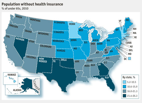
And so it goes: cartographers are the artists and we GIS people are mere data drones. But there are a couple of shortcomings to this divided state of affairs. First, there are way more GIS people cranking a lot more maps than our less numerous cartographic brethren. Secondly, not only do GIS people give birth to many, many more maps than cartographers, the majority of our offspring are homely, with some downright ugly.
Most Don’t Have Time/Inclination for the GIS + Illustrator-Photoshop Workflow
It’s not about the GIS masses throwing on black turtlenecks and plopping down $1100 for Adobe Creative Suite: most of us will never get beyond the five things we’ve figured out in Photoshop (that can now be done for free in the browser at pixlr.com) and rudimentary vector editing in Illustrator. The biggest issue is that we don’t have ‘the eye’ that can easily translate between tool and effect, and even a modestly complex .ai or .psd file is completely bewildering when trying to tease out from the layers window exactly “how did they do that.”
TileMill to the Rescue: Simplicity + Attainable Elegance
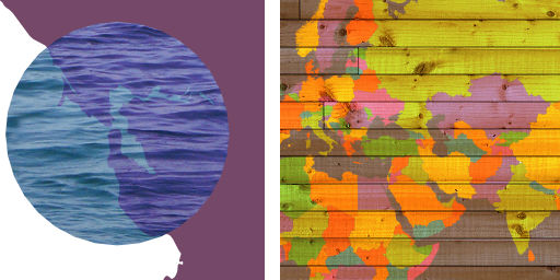
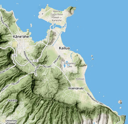
TileMill is a free, open-source cartographic studio that I’ve used for creating decent-looking web map tiles (it also exports to PDF, PNG, and SVG) without needing a desktop GIS in my workflow. But with the new release, a whole slew of sophisticated compositing and masking effects have been added to the Mapnik rendering engine that bring Photoshop capabilities without Photoshop complexity.
CartoCSS: Emulation through Copy-and-Paste
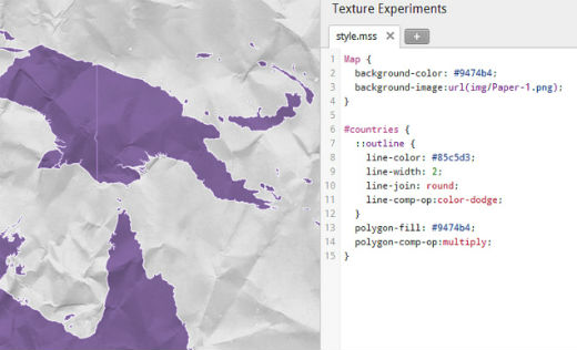
You can’t overstate the importance of having all of your styling specifications in one place, human-readable, and eminently copy-and-paste-able in a CSS grammar already familiar-ish from mainstream web development. Now we GIS people who freely admit to not having an eye for quality cartographic technique can do what we do best: steal from the more talented. While ArcGIS has added considerably to its cartographic capabilities, I can’t copy great technique because those specifications, as Mr. Fee points out, are buried in multi-level, multi-tabbed, modal form hell. As for the SLD standard put forth by the OGC, its XML-ish awkwardness and verbosity has prevented traction in most everyday workflows.
Let’s Spread Cartographic Best Practices Far and Wide
As a non-dues-paying, non-member of NACIS (North American Cartographic Information Society), I nonetheless offer the excellent advice that CartoCSS + free cross-platform design software offers an unbeatable opportunity to disseminate best practices and techniques far and wide. Throw a few grand at a couple of talented grad students to show us aesthetically-challenged what we should be doing…with data and CartoCSS samples: we can figure it out from there and make our world of GIS maps noticeably more aesthetically pleasing.
—Brian Timoney


