Why We’re Smarter on Sunday: Sports Analytics & Business Analytics, Part I
by Brian Timoney
We all remember when we first fell in love with tabular data.
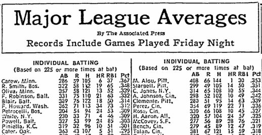
For me it was the list of baseball batting averages of every major league player that was published in the Sunday newspaper. Still in church clothes, I’d commandeer the sports section and, donut in hand (the other Sunday indulgence), spend the next twenty-five minutes digesting line-by-line the offensive output of hundreds of players.
In 2014 it’s a bit different: all of this information and much, much more gets updated in near real-time on my phone.
We sports fans live a very strange cognitive double-life: we’re far more analytical about the teams we cheer for on the weekend than the organizations that provide our paychecks during the week.
* * * * * * * *
Information So Important, It Comes Once A Month
Before the first Friday morning of every month, a curious hashtag pops up on Twitter: #NFPguesses. Economists, business journalists, and assorted finance types weigh in with their guesses of the US unemployment rate and jobs added to be reflected by the Non-Farm Payrolls (NFP) report.
This number moves markets and political polls.
And it comes out once a month.
UPS used to have a slogan “moving at the speed of business”. Turns out, even in 2014, a whole lot of business is based on the same old monthly and quarterly reports–just like in 2004, 1994, 1984…
In part III of this series we’ll examine the tempo of data and business models. Suffice to say when we tell our grandchildren about how we used to gather around Twitter at 8:30AM EST on the first Friday of the month to get the latest unemployment numbers, it’ll sound stranger than the Pony Express anecdotes of yesteryear.
(Well) Beyond the Pie Chart
Not only is the sports world is ahead of most of the work world in the tempo and freshness of its data, but it’s also showing itself more adventurous in the realm of data visualization.
An interesting application of heat mapping seen in the Daily Telegraph and BBC’s Match of the Day are the plots of player movements in the other football (soccer). Below is a heat map of the wandering lethality of Chelsea’s Eden Hazard against Manchester City–
Worth noting that Match of the Day is broadcast on late Saturday evening in the UK: can we assume a good portion of the viewing audience is less than 100% sober? And yet what they’re being called on to process is more nuanced than whatever xeroxed chart is being passed around at our Monday morning staff meeting.
Where presumably everyone is 100% sober.
A Geographer Dominating Sports Micro-Geographies
Here in the States, some of the most innovative sports visualization is being done by Geographer Kirk Goldsberry. (Like a legit Geographer–PhD and everything). And we’re not talking a few color plates accompanying a paper in the Annals of the AAG–his stuff appears on ESPN’s web platform.
Which would make him the most read academic Geographer working today.
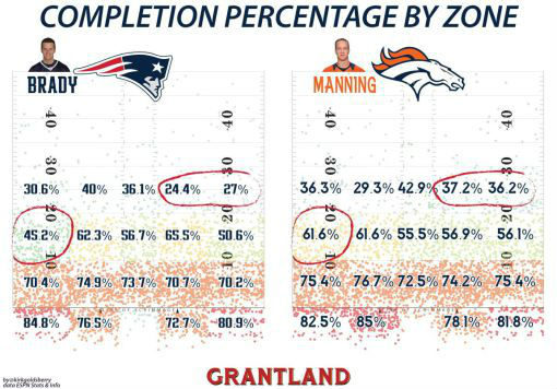
What’s worth pondering about Goldsberry’s work is how he communicates dense, multi-variate data to a very large general audience and draws out the most salient information, even it takes hand-drawn circles. One of the bigger sins of visualization is, in the name of displaying all of the data, not directing the viewer to the most interesting/important information.
And not providing a meaningful point baseline of comparison.
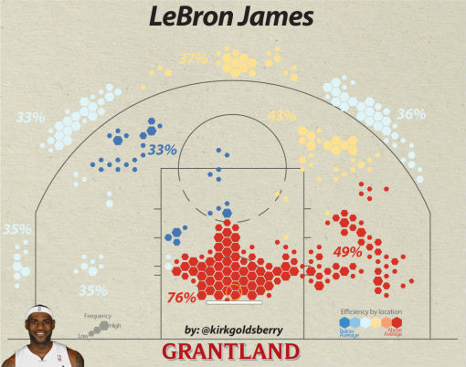
What I like about the chart below is that the variation in LeBron’s shooting percentages in different areas of the court is a little bit interesting. But it’s the diverging color-ramp of “efficiency” that lets us assess his relative strengths compared to other players in the league. Those dark blues and dark reds are the real story of the visualization.
No Cheering in the Office
What’s been fascinating about the rise of sports analytics is that the momentum has been largely created outside the leagues themselves. Take the emotional over-investment of a large portion of the public and amp it up with gambling, fantasy leagues, and multiple 24-hour sports tv and radio networks: the hunger for information is immense. Despite the data deluge, resistance among traditionalists has been very real over the last 20 years. In part II of this series will take a look at the battle happening both in your workplace and the stadium: the struggle between Analytical Insight and Reputational Risk.
—Brian Timoney
