The Road to Bad Policy Is Paved By Good Intentions and Misconceived Maps
by Brian Timoney
One blessing/curse of Twitter has been its singular ability to bring all manner of maps to my timeline and seize my attention one 8-second increment at a time.
Some are interesting/cool/fascinating.
Some make me laugh.
Some are so cringe-worthy, I feel compelled to re-tweet.
And a few leave me muttering “no, no, No, No, NO.”
“NO”
Because sometimes the stakes are much higher than a graphic artist at an elite publication making rookie cartographic mistakes. Sometimes maps influence policy, guide funding decisions, affect real lives.
This is one of those times.
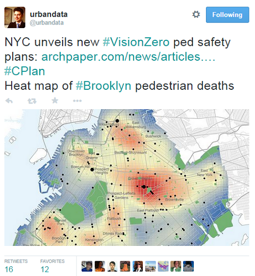
The above map comes from the recently released “Vision Zero Pedestrian Safety Action Plan: Brooklyn“, part of a larger effort in New York City to address the persistent problem of vehicle/pedestrian collisions.
When Is Heat Map Not A Heat Map
Kenneth Field has a recent thorough post on the all-purpose moniker “heat map” being applied to kernel-density maps. Let me give you my oversimplified Cliff’s Notes version in light of the above map:
a) ‘Heat maps’ obviously take their name from the familiar temperature map where the actual temperature is measured at specific point locations and a temperature for all of the unmeasured areas is interpolated. But the map above doesn’t make sense in this context because we know the exact data values for every other intersection in Brooklyn without a dot on it: zero pedestrian deaths.
b) In creating “hot spot” maps we are also strongly implying that the conditions causing the phenomenon being mapped are propagated generally over space. But when we think about the factors contributing to pedestrian deaths–traffic volumes, pedestrian volumes, street width, speed limits, visibility issues–they have such a geographic specificity that a side street intersection could be very safe although it’s merely a block away from a demonstrably dangerous intersection.
If You’re Diffusing The Problem, Are You Diffusing the Impact of Policy?
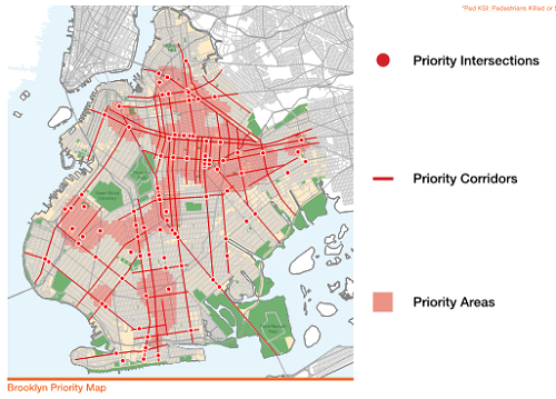
To be fair, the report talks about Priority Intersections and Priority Corridors: all to the good, given the pattern of our data points.
But what concerns me are the Priority Areas because of the discussion above of how spatially specific are the conditions that endanger pedestrians. Consider the item of the Action Plan that calls for “60 new speed bumps in Brooklyn annually”. Where will it be most difficult to install speed bumps: the busiest corridors? Along bus routes? But the relatively diffuse “Priority Areas” open up the option of making sure we hit our quota of 60 bumps per year by looking at less contested spaces on sleepy side streets. The plan will be executed, but will the impact be significant?
Representation Matters (Again)
As an outsider, I clearly see the time and effort that went into the report: from collecting and analyzing the data to holding inter-agency meetings and gathering input from the public–all creditworthy. Often enough objections to cartographic choices are brushed aside for being fussy and pedantic: “my points are correctly located, my North arrow points up, so please shut up.” And “heat maps” have never been easier to make–so why not create a compelling visual that will be seized on by the press and Twitter?
Because maps frame problems and drive policy solutions. The above maps invite resources to be channeled into areas with relatively low pedestrian risk–muting the impact of precious public dollars.
Despite everyone’s good intentions.
—Brian Timoney

