MapBrief™

Geography · Economics · Visualization

The New Golden Age of Cartography Has Arrived…and It’s Co-Ed

That the web mapping explosion of the past few years has ushered in a new Golden Age of Cartography has been noted more than once (here, here, and here). But what is really exciting is that the increasing variety of tools for map-making are engaging folks from a variety of disciplines, including the emerging field of Information Design. For those of us with traditional GIS training, the delight of encountering great cartography in unexpected places is tempered by the realization that while we GISers are good at making maps, we seem especially adept at making ugly maps.

Recently, this issue of Ugly got an interesting airing on LinkedIn (of all places). Opinion ranged from aesthetics-are-important to just-get-the-data-to-line-up to the reliably defensive you-callin’-my-map-ugly?  I think back to my first introductory GIS course where we learned the old chestnut that 80% of a GIS project’s budget is taken up by data acquisition and whipping it into usable shape.  By the time it comes to making the final product–a map–there’s been enough wailing and gnashing of teeth that the default color palette and the generic symbol set seem plenty OK.  That, and your project is over-budget and past its deadline.  Little wonder then, that Ugly in GIS became Good Enough.
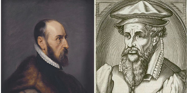
 

        Ortelius and Mercator: The first golden age of cartography was very Dutch and very male


Another equally important thing I learned in grad school is that one never wants to be accused of heteronormative essentialism. Around the grad school seminar table, that’s the male equivalent of being Hester Prynne. But even though I’m a guy, I occasionally notice things.  Like my first line of defense against the onslaught of Ugly is the indispensable Color Brewer, the brainchild of Cynthia Brewer at Penn State. Like looking up “GIS cartography” on Amazon brings up Gretchen Peterson’s  GIS Cartography: A Guide to Effective Map Design. Like ESRI’s Mapping Center, headed up by Aileen Buckley, is almost evenly divided between men and women. In an industry numerically dominated by front-pleated khaki-wearing dudes (author included), such data points are something other than mere coincidence.

And since the singular form of data is anecdote, I’ve noticed in my own consulting work that my female clients are much more willing to articulate their reactions to my design decisions.  At the other end of the critical spectrum are my overwhelmingly male Oil & Gas clients for whom there is no combination of garish yellows, reds, and greens that will elicit more than a grunt or a shrug. Like being on a group camping trip, as long as no one showers, the pungent funk goes unnoticed.


Besides being a well-intentioned shout-out to the design eye of the ladies, why does any of this matter?  Because good design enhances comprehension.  As the stories we are trying to tell with maps become more multivariate and nuanced, the penalty for thoughtless design is at best puzzlement, at worst misunderstanding. We have arrived at a point where the ‘general user’ does notice the difference in cartographic presentation between Google Maps, Bing, Mapquest, and Open Street Map. And as we’ve been told ad nauseum in the past week, the genius of Steve Jobs was understanding average folks form intimate attachments to great design.

~  ~  ~  ~  ~  ~  ~  ~

This past weekend, we were inundated with online maps of Hurricane Irene and its menacing of the East Coast. In the aftermath, I came across this interactive map by the New York Times –the pace-setters when it comes to online information design. Clean layout, easy navigation, and a variety of thematic mapping techniques all making bulky, multivariate data accessible to the average user.  Scrolling down to the bottom, I noticed the authors: Joe Burgess, Amanda Cox, Alicia Parlapiano, Archie Tse, Lisa Waananen and Tim Wallace.

A new golden age indeed.


—Brian Timoney
FOSS4G: Not the Company Line, But a Whole Climate of Opinion

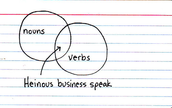
There comes a time around late morning of the second day of a vendor conference where it dawns on one that particular terminology, certain phrasings, are echoing from the keynote stage to the demonstration kiosks. The presumption of authentic communication misplaced, one despairs not of Orwellian doublespeak (let’s not flatter these people), but of the sales pitch masquerading as naturally volunteered information. Sometime in the run-up to the show, the in-house indoctrination orientation slide deck became mandatory reading, lovingly crafted by someone with an MBA, probably in Marketing and Communications.

 
At FOSS4G next month in Denver, one needn’t fear the company line–there won’t be one. Instead we’ll have a republic of voices: deeply knowledgeable voices that belong to real people not regurgitating pre-approved mantras. I’m looking forward to talking in person to so many folks whose stuff I’ve read and learned from online. Not only the bigwigs of geospatial blogging, but also more niche voices with a knack for passing on well-timed nuggets of specialized know-how.

Glancing over the RSVP list, here are a few of those voices who will be in Denver:

Dave Bouwman Martin Daly Peter Batty
 
James Fee Sophia Parafina Bill Dollins
 
Andrew Turner Jason Sanford Mikel Maron
 
Sean Gillies Dale Lutz Kate Chapman
 
Geoff Zeiss Frank Warmerdam Regina Obe
 
Tobin Bradley Randy George Christian Spanring
 
Paul Ramsey Allan Glen Mano Marks

 
To be sure, the above is a mere sampling: there will be other rooms, other voices. Join us for the conversation.


—Brian Timoney


* image courtesy of the genius blog Indexed
 

Mapping the Census and the Sincerest Form of Flattery

The life of an IPO-less entrepreneur is a curiosity, especially in difficult economic times. So when well-meaning folks ask “what is it like?”, I answer that while there’s great freedom in working on one’s own ideas, that’s counterbalanced by the realization that most of one’s ideas range from the merely unworkable to laughably money-losing. But failure can be a more effective teacher than success: stay in the game long enough one develops a bit of judgment in distinguishing wheat from chaff.

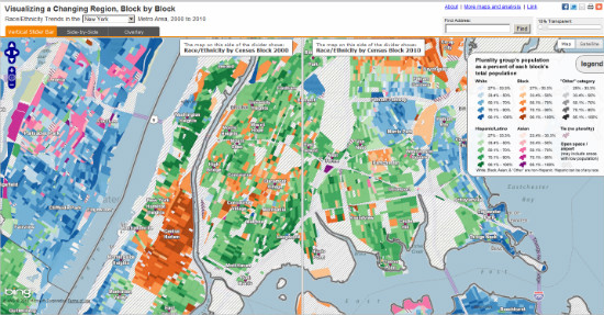
So when Steve Romalewski and his team at CUNY’s Center for Urban Research released their block-by-block race/ethnicity maps for 15 major cities, my immediate thought was “this is an extremely cool way to understand important patterns in a very bulky data set.”

My second thought?  “I need to steal this.”

    This CUNY map of racial/ethnic change using 2000/2010 Census inspired me...to thieve


(If you believe the famous Picasso quote “good artists borrow, great artists steal”, then ponder to what depths of mendacity a work-a-day web mapper willingly lowers himself.)

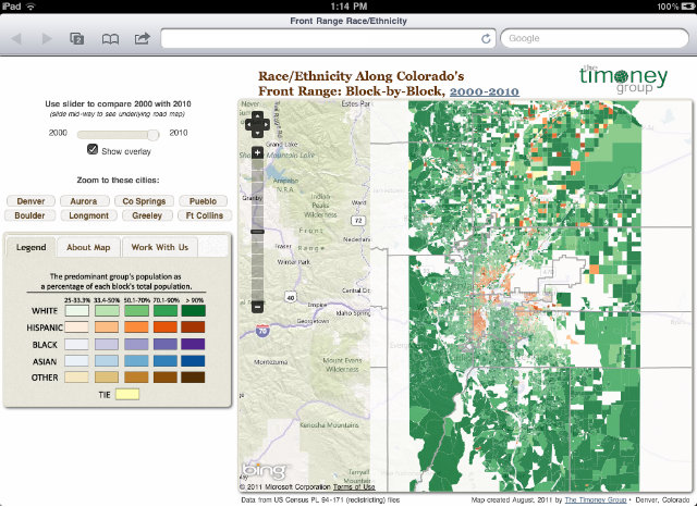
Working on the decennial redistricting process in Denver, we applied CUNY’s mapping technique to our own data and found a fascinating mix of gentrification, edge growth, and ethnic-group displacement that will have a substantial impact on the city’s politics in the next decade. So I thought making a web map covering Colorado’s Front Range (roughly Pueblo to Fort Collins) would be both intellectually interesting as well as a chance to work with some newer tools.

Map: Race/Ethnicity Along Colorado’s Front Range: Block-by-Block, 2000-2010

Like the CUNY map, we’re using the Bing basemap for its thorough neighborhood-scale labeling as well as easy REST tile access. Using a custom slim build of the latest OpenLayers dev release, we get the new touch support. Throw in a touch of CSS magic from Tobin Bradley’s GeoPortal project, and we get a decent-looking map that works on touch phones and tablets with little extra work. The tiles themselves were created in the TileMill cartographic studio: a true pleasure to use and a tool that will merit its own post next week.

(I’d be remiss if I didn’t mention that FOSS4G will have OpenLayers guys, Tobin Bradley of GeoPortal, and the Development Seed crew who created TileMill.)

iPad goodness with little extra effort

    New OpenLayers touch features + GeoPortal CSS give us iPad support the way we like it: out of the box


From a developer’s perspective, the map doesn’t “do much”: a couple of tile layers, a slider, and zoom-to buttons. No round-trips to a database, no drill down information. While unpaid side work definitely puts one in the mood to simplify, it’s also out of respect to the intended audience of non-technical users in Colorado. Because chances are they surf like you and I surf: with a bit of ADD and very low tolerance for anything that confuses and may require reading the Help. So the goal here was to create a pleasant 40-second experience: play with the slider, click a few buttons, and then on to the next thing. The 1% of the audience that is really into can get in touch for more.

It’s an exciting time for web mapping and cartographic design: roll up your sleeves and start stealing.


—Brian Timoney