“Finally: the election map that isn’t a lie.”
by Brian Timoney
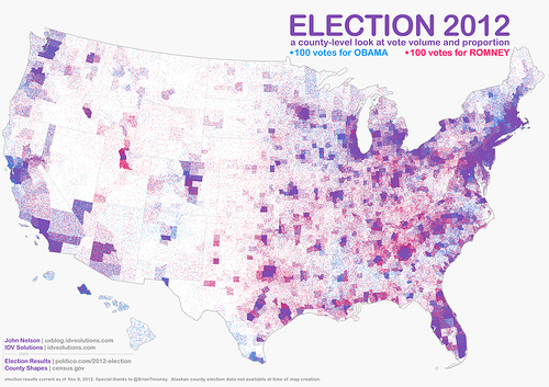
Best-selling science writer James Gleick refers to this map by John Nelson a bunch of us were linking to over the weekend (click for larger version):
Dot-Density, FTW
Based on similar work by Kirk Goldsberry, John took county-level data and posted a red dot for every 100 votes for Romney, a blue dot for every 100 votes for Obama. The map effectively preserves the familiar geography of the continental US while accounting for the wide variation in population density. Further, areas of electoral dominance by each candidate are easily identified, while the hues of purple effectively communicate mixed voting preferences.
The Limited Usefulness of Cartograms
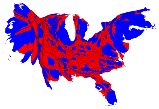
I recall cartograms rising to prominence in the wake of the 2004 election with the maps of Gastner, et al at the University of Michigan. Mark Newman has continued that work and put out maps for the recent presidential election. Here’s his cartogram based on county-level data:
In my mind, the cartogram is most effective in counteracting the visual dominance of the large “red” states in the middle of the US that tend to be more sparsely populated than the more densely populated coastal areas that often vote Democrat (in cartography-speak: the areal unit problem). But in re-shaping areas based on population, the cartogram runs up against a severe cognitive limitation:
Humans are really bad at visually comparing areas of shapes
Or, to put it another way,
HUMANS ARE REALLY BAD AT VISUALLY COMPARING AREAS OF SHAPES
This inability to accurately compare relative sizes of 2-D shapes are what make pie charts such a flawed approach to comparing quantities. Add in the irregular shapes of counties, let alone the audience familiarity, or lack thereof, with the actual county sizes and shapes, and you’re left with a visual that doesn’t easily lend itself to close, prolonged inspection.
Contrast it to John’s map where the viewer is invited to closely inspect and discover all sorts of interesting patterns: the reds of Appalachia, the blues of the 19th century slavery belt, the surprising purple found in the Salt Lake City metro area, etc., etc.
Who Decided Democrats are Blue and Republicans are Red Anyway?
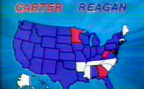
Interestingly there is no Constitutional amendment decreeing Democrats be depicted in blue and Republicans in red. This interesting Smithsonian post claims it wasn’t until 2000 that the familiar color assignments became the de facto standard and set the stage for all manner of sociological comparison.
Elections Are Good For Mapping
High profile elections raise all cartographic ships. Friends and family mention specific maps they’ve seen in the media, etc., and we in the industry try and soak up the vicarious admiration. And the maps that stand out, such as John’s, invite others to share in the intellectual satisfactions of geographical exploration that led so many of us to make this avocation our vocation.
—Brian Timoney
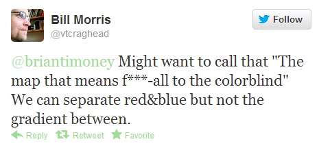
UPDATE: A valid criticism has been lodged–
In 2012, the color-blind are America’s forgotten 8%.
